
|
Early on, when we were in the planning stages of the graphic novel, we had to ask ourselves a lot of questions. What were the most important elements of Emily's story: what do we keep and what do we let go? Of the many styles and directions we could go, what design do we choose for our web-comic? How do we include the feeling of the Victorian era, in a time period that feels far distant? How do we make it feel like Emily's world?  The main idea in our heads for the overall theme was that of a Victorian Scrapbook. Ah, those elaborate conflagrations of calling cards, magazine cuttings and mementos that Victorian crafters seemed to utilize as a way to get out their creative urges. But sometimes, those early Victorians over-did their urges...quite a bit. So, we decided to keep that feeling minimal. Maybe pull it in here and there in spots. An element here, and a touch there, and every now and then when the page called for it, one of those really elaborate backgrounds that feels like something that someone from Queen Victoria's era may have hand drawn. 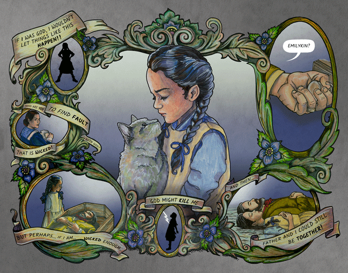 But some pages are just moving the story on to one story element or the next and not all call for something this "designy". So what do we do for our backgrounds THEN? I remembered Emily's eye trick. Remember how she could see the wallpaper in the air? In Chapter 6, we learn that Emily, "by a certain movement of the muscles of her eyes...could produce a tiny replica of the wallpaper in the air before her". (By the way, Daniel surmises that Maud's description of this perfectly describes a stereoscopic effect that some people can get by crossing their eyes while looking at any repeating pattern.) Although I might not be able to include this interesting piece of trivia about Emily in our story, we figured we could certainly use the idea of her "fairy wallpapers" as the go-to for many of our backgrounds.  Part of this means using real Victorian wallpaper in our backgrounds (in the above case, we took photos in a historic Victorian era house that we based Douglas Starr's rented house on). But, we thought it would also be fun to remember Emily's love for creating her "fairy wallpaper" in the air, when it came to the backgrounds for our full pages.  There's one other facet of this fun fact that I want to mention and it has to do with the rather strange wallpaper we chose for Emily's own room. In our research, we learned that Victorians who were a bit less well off, might not be able to afford real wallpaper. So they would sometimes fake it by using newsprint and magazines on their walls. 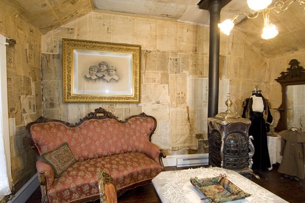 Emily mentions herself being quite used to pinning her special pictures up on her own walls, and so it seemed to be reasonable to imagine that the little upstairs room in the house her father rented, may have been papered with newspaper. It's a little remembered factoid from a bygone era that adds to the overall intrigue of the Victorians. But interesting, nevertheless. I mean, in what other time period can you paper your house with cocaine ads and still be perfectly innocent in motive? And yeah, that bottom right hand ad is totally a mini artist Easter egg tribute to Montgomery. 
0 Comments
The Emily of New Moon graphic novel is currently set up to view here on our website, almost like an online web comic. As you've probably noticed, we're releasing it page by page (as we complete it), and we are fitting about 10 art pages per webpage. But the final delivery of the completed graphic novel is meant to be released as a 3D experience. What that means for us, is that as we build it, we are drawing each layer separately. 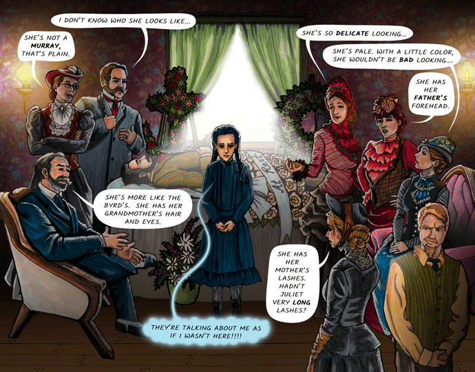 So for instance, page 14, seen above, is actually made up of the back wall, the characters closest to the back wall (each of which was drawn separately), Douglas Starr, then Emily and the closer characters, followed by the characters closest to our view. Even the funeral flowers were drawn each as their own separate entity. Now in some ways, this adds to the time investment. But in others, it gives us flexibility with our end image...AND it makes it possible for us to easily utilize an interesting feature that Facebook recently added on its social media platform: 3D pictures. Sadly at this point in time, the 3D imagery is not supported for Android devices. We decided to create a little video of our process and the end result, so those of you who have Android (like myself), can check out what others have been ohhing and ahhing about on the Facebook page (which you can find at https://www.facebook.com/DejaVuDimensionsEoNM/ ). Daniel is the magician behind all of this. But as you can see from the video, he turns each layer into grey value between black or white, with layers closer to our view, lighter in color, and those further from view, a darker color. Then, he simultaneously uploads both images (color and depth) to Facebook, and the platform does the rest (the depth image being defined by "_depth" being tacked on to the file name). Movement, like that shown in the video can then be seen. Which is kinda fun and feels interactive.
It's fun to experiment like this, and it gives our fans an idea of where we are heading with our 3D experience, although on a limited scale. But, rather than just images that move, wouldn't it be neat to get to walk on Prince Edward Island in Virtual Reality? Maybe walk into New Bideford Parsonage, (which is what we are using as our model for New Moon? These are the kinds of things all fans dream of getting to do, but not all can, for one reason or another. So, we want to offer that as part of the "Emily Experience". It's where we're going. And I think it's exciting to give you all a glimpse into that. Even, by just using Facebook's 3D photos.  Every great story begins with great characters. If there was one thing that Lucy Maud Montgomery was excellent at, it was the creation of her characters. They aren't one dimensional individuals that grew on a page and stayed there. Her characters are living, breathing individuals that reek of humanity with all its quirks, both good and bad. Anne of Green Gables LIVES for her fans and Anne is so real that we all want to be her best friend and we, too, are searching for "kindred spirits" in our modern lives. Josie Pye might be the "villain" in Anne's story, but she also can be found in every high school today. And somewhere in our past, is a wretched schoolteacher that pretty much fits the description of Mr. Phillips. Hopefully, we all have a Miss Stacey somewhere back there, too. Point is, LM Montgomery already did our job for us, in creating characters that leap off the page of "Emily of New Moon". The least we could do was attempt to find character references that somewhat fulfilled her beautiful vision.
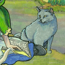
Sometimes, things are just meant to be. Bridget's brother Kyle had the right look. We set up an audition time and then met him in person. When we introduced him to the character of Cousin Jimmy, he was interested and willing and the man can ACT for photos. The rest is history. Kyle IS Cousin Jimmy to me now, and I think he always will be.  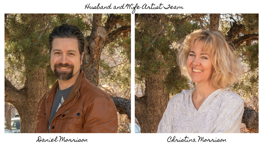 It's definitely a team sport, this graphic novel creation thing. Sure, there's the actual drawing of the art, and that's in Christina's ballpark. Sorta. Because it actually starts earlier than that. Back in the conception stage, Christina and Daniel work together to brainstorm the storyboard. 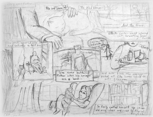 The storyboard concept is crucial. It serves as a blueprint that we work from. We use it as a reference for lighting, a reference for the photographs and a reference for the final layout and animations. Once the storyboard panel is complete, we can begin taking photos. The photography is Daniel's department. Photographer extraordinaire, he sets up lighting and tries to recreate the poses in the storyboard as accurately as possible.  Animals are tricky by the way. And we have a great cat who helps us out with cat poses with incredible grace and cheery attitude (for a cat). But she's not a lap-cat naturally and seemed to be saying, "What the HECK, guys?? I'm outta here!" Not a problem: we snapped her looking content on another day and still got a pose that worked. 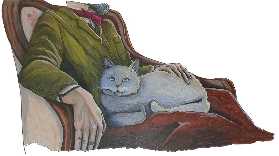 Once we have photos, it's Christina's turn to take those references and draw them as art. Usually, they're drawn a little larger than they will appear on the page. They're also drawn in separate layers from their cell image. This is so that we can reuse the art later, when we are putting together the graphic novel as a "Graphic Novel VR Experience". Surprisingly one of the easiest steps turned out to be rather tricky: scanning the art. Daniel tried traditional flatbed scanners but was disappointed in the color reproduction and clarity. Ultimately, he ended up shooting each piece of art like a panorama with multiple shots and stitching them together. He also shoots, using cross-polarized light and filtering because otherwise the reflections of the artwork can corrupt the values. It was a bit of a trial and error process but the end result is at full print resolution. 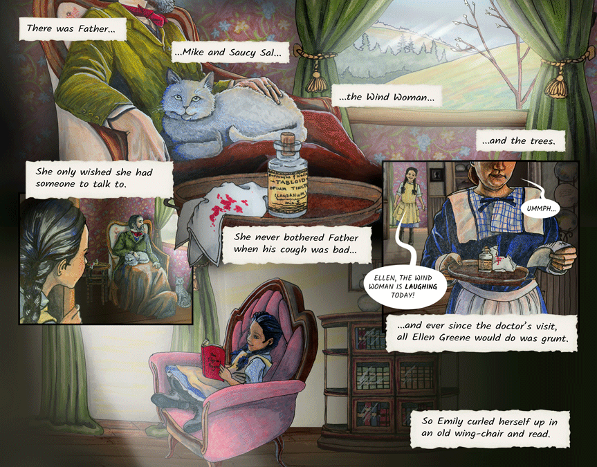 Once all the pieces are drawn, we cut them out and put them together in our layout. Then it's time for the animation. Daniel takes the element that we previously decided would be used for the movement and creates a "cinemagraph". This is where that little added animation adds a ton of visual interest. Some of these might be developed in an effects program but many are simply basic frame by frame, hand animation.  Ultimately, these cells will also be presented with depth to each layer in virtual reality. That is why we are producing and isolating each element separately. We are developing the coding to map each dimensional and animated page into a virtual 3D book experience. 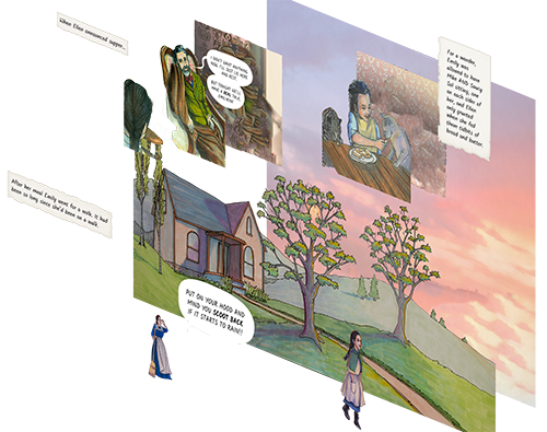 We talked a lot about what a virtual reality graphic novel experience might incorporate and what really adds value, versus simply costing more development time. We want the experience to feel like traveling into the world of "Emily at New Moon". We're working to scan actual historic locations so that as you progress through the story you virtually experience those surroundings.
We also question how much we should gamify the experience and what role audio will play. It isn't really a game so we've decided to keep gamification to a minimum and simply offer the viewers easy access to this rich experience. Likely, we will have more than one experience mode. Great audio is paramount to great presence in VR, but we also don't want to rob our readers of the experience of reading. So the audio supports the environment ambience primarily instead of giving us a full narrative or character performance. We want our readers to have a heightened experience of hyper-realism not to feel like they sat through a movie. We have our first cinemagraph pages up and running! In other words, the first two pages of our graphic novel experience our up and available for viewing.
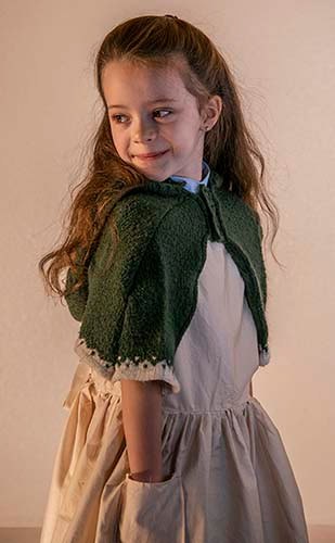
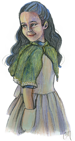
We have locked down the actors we're using as character references for the first 30 or so pages of our graphic novel (introduction to Emily and all her relatives). There were a surprising number of costumes to be created, but, we pulled on our creative sewing powers and little by little, our characters began to come together. 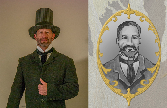 Having character reference photos helps keep my art consistent, and also helps it go faster. Drawing out the artwork completely off the cuff takes me (Christina), more time. But when I can begin with one of my characters photographed in the pose, it cuts down on the time I have to spend making sure that an image looks accurate, and is what I wanted. I'm hopeful, that working this way will cut my creation time down immensely. This is why the upfront time spent on costumes, and historical research is worth my while. 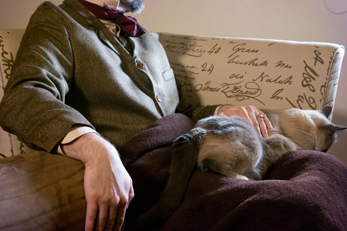 Here's how it works: We start with a beautiful, well-lit image (thanks to Daniel's photography prowess) and then I take that basic image of Emily's father sitting and recreate it as a drawing. Obviously, there are still a few things I have to artistically adjust. Our cat was not cooperating here, so I used a different photo where she was sitting pretty. And this modern chair was not going to work, so we tracked down a different image reference for a chair from the Victorian era. But simply beginning with this photo, helps me to draw and color an image that is realistic to lighting and clothing folds much more quickly than I could do, without the help of photography for a reference and gives me more upfront control of the finesse of my art. 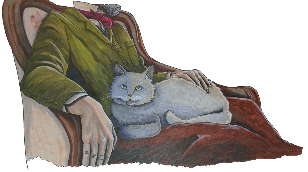 But with the drawing beginning, this is where it all gets so fun. The story is about to start coming together, and we will be sharing it with you here. Keep checking back, because we'll start sharing our pages here on the website, as they come together! 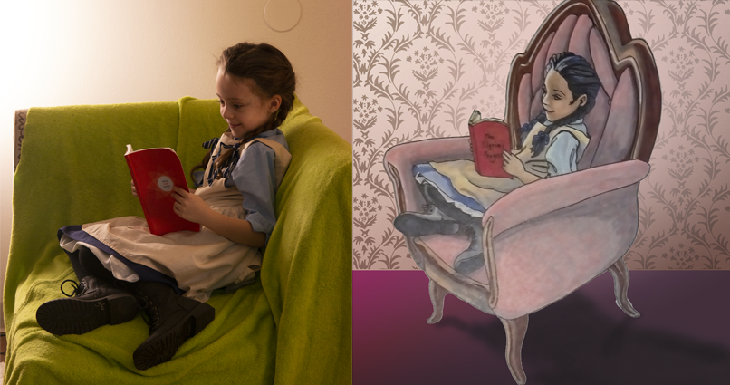
Back to my original dilemma. Christina is a fantastic artist with amazing skills in multiple art formats. She's done lots of traditional acrylic paintings and frankly I'm jealous of her 2D tooning skills. In our process she'll use the photographic reference and paint the artwork. In this project she will largely be using colored pencils and Copic markers. Her results are beautiful.
The challenge here is that we want to deliver a graphic novel art style. What we want is simplistic details and highly expressive faces in the language cues of a beautiful graphic novel. For this process we explore different art styles and dial back the details. To be honest this is one of the most difficult parts for me because I love resolution and I love Christina's traditional art. But we finally find our desired graphic novel art style and we are off to the races. Only six hundred or so more of these to design and paint!
We have found our Maywood House Location! We drove up to Breckenridge the other day to check out several potential Victorian house museums (turns out that Breckenridge, Colorado was a hub of Victorian society, back in the day--who knew?) and we were delighted with the "William Briggle House" for Emily's home where she lives with her father.  Even under a foot of snow, you can see the "Victorian bones" of this home's structure.
And the inside was just as delightful! In L.M. Montgomery's story, Emily describes her Maywood home as looking a bit like a "big, brown, mushroom", so when the house is drawn, we might adjust the roof slightly to have a more mushroom-like appearance, but other than that minor change, we feel confident that this Victorian home will make a perfect art reference for the first 34 pages of the graphic novel. Of course, this is just the first of many locations that we will be scouting and utilizing for the graphic novel. Even the Maywood location will require more art reference locales. For example, even though most of the action in Maywood takes place on the interior of the home, the outer scenery of Breckenridge is a far cry from Prince Edward Island in appearance, and anyone who has read any of Montgomery's works can vouch that the outer landscape of her beloved island was incredibly important to her stories. Yet, this location discovery is a good step forward and we can move on with preliminary background sketches right away. Okay, to be fair I made up this train wreck of a descriptor... but I have a reason. Have you ever seen a cinemagraph? It's just a GIF file but with a fantastic little detail; one single element is in motion. It might be swaying hair, a moving reflection or a liquid eternally pouring as the GIF loops indefinitely.
These are the kinds of effects we intend to tastefully add to our digital graphic novel and the virtual reality experience. This is where we get our name for a graphic novel enhanced with cinemagraphs... cinemagraphic novel.
We've seen even more enhanced and animated comic experiences but they seemed overly done and seemed to detract from the main story. So this is where we landed. Not every cell will have a cinemagraphic effect. Instead, we will utilize a cinemagraphic effect at a rate of about one per page. We think you'll enjoy it! Deja Vu Dimensions has been busily ingesting the story of Emily of New Moon and translating it into storyboards to plan our virtual reality graphic novel. It's a little like how a director does a breakdown of a film script to account for locations, characters, costumes and the like.
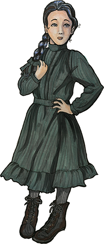
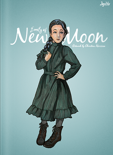
This is also a period production which is set in the 1880's so we are all doing our homework in the development of the design bible. We're looking up hair styles, architecture, clothing, facial hair, social norms and more. It's just what it takes to be confident that we are serving the period and original work with honesty and authenticity. But there is also a point where the text we utilize from the original story goes through a slight modification for the audience that will be reading it. 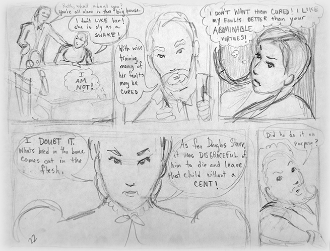 We believe it is somewhat unique to present a graphic novel both for the web and for virtual reality. We'll be 3D scanning locations, casting reference actors, creating reference costumes and even possibly integrating the use of neural networks for depth prediction of imagery. It's quite a production and we can't wait to share it all with you. Christina Morrison is our head artist and she's doing a fantastic job.
The web delivery of the graphic novel will be freely available and updated as pages are completed, so be sure to bookmark it and follow along. The virtual reality graphic novel will be available for purchase for popular VR headsets. This blog will offer viewers a behind-the-pixels view of the production and development process. We are so excited to have you along for the ride. Enjoy! |
The TEAM
Two artisans and tech professionals, Christina & Daniel Morrison bring you a new type of VR graphic novel experience. 
Archives
June 2019
Categories |


 RSS Feed
|
Making Magic
|